Color Theory for Modern Branding
If you’ve heard of color theory, especially if you aren’t an artist or designer, you’re probably most familiar with something like the color wheel. Many of us were introduced to color theory and the color wheel during art classes in elementary school.
Or you may know emply it in your own life based on culturally taught concepts like that blue is calming, red is for warnings, and brown is earthy. Perhaps you even are familiar with it from seeing Tiktok videos where people used a filter to figure out which colors suit their skin tone best.
But what exactly is color theory, and is it still relevant today, or just a bunch of outdated concepts?
What Is Color Theory?
Historically, color theory was an idea system that created standards around what was considered aesthetically pleasing. That was decided based on rules around what were considered balanced/appropriate color pairings and uses.
While it’s hard to know exactly when these ideas first began to be recognized and used as rules, in the Western World (read: mostly Europe) color theory first begins to appear around the mid 1600s. During this period, Sir Isaac Newton popularized the use of the color wheel most of us know as the emblem of color theory today.
It’s important to know the historical aspect of color theory to understand this next point: Classical color theory is not the same as current color theory.
As we develop more concepts and a wider understanding of everything from how our brain processes information (including color), to the ways in which cultural practices involving color impact our perceptions, some of the prior concepts assumed to be correct are discarded or updated.
How Color Theory Has Changed
To be clear, I am not claiming that color theory in its classical forms is not still taught. It is. But while classical color theory may still be around, it isn’t the only way to understand or employ the concept.
When color theory first became a central tenant of the art and design world, it was pre-scientific method. Whole encyclopedias of how we understand anything, let alone human perception and cognition, were completely unknown. People like Newton thought we all are working from one set of instructions for how to relate to, experience, and perceive the world.
Now, we know that isn’t true. Our brains are amazingly adaptable, and can form meaning and understanding of color based on a variety of different experiences. Ranging from when we first experienced a color, the use of a particular color within our cultural upbringing, to having a particular color in our field of vision when a traumatic experience happened.
Which means not only is the classical color wheel culturally standard only to a small sliver of the world, but associations with red, or white, or brown are culturally-defined as well.
Color Theory in 2022
So what does that mean for a designer, brand manager, or marketing specialist looking to use color theory to inform the choices they make in their work?
First: know your audience.
If you’re working with people in the US predominantly, you likely assume black is considered somber, serious, and even associated with night and death. Meanwhile white is considered to be a symbol of airiness, weddings, and even cleanliness.
But those meanings aren’t inherent. They do not come from some part of our brain that universally assigns those meanings to those particular colors.
Instead, when we say “blue is considered calming,” what we really mean is that blue as it is and has been used in our culture has been assigned the meaning of calm.
And even within the US, the culturally assigned meanings of colors can change depending on the history and background of the culture a person grew up in. In many cultures that have strong diasporas in the US, white is a color you wear to a funeral.
Second: know your industry.
Cultural assignments of meaning can come from many places. For branding, whether or not a color is considered correct is in some way impacted by how large and well-known brands in your and adjacent industries use colors.
Think of Coca-Cola. They use red and white a their primary brand colors. In classical color theory, red is related to danger, sex, blood, and anger.
Not really the color you’d want to use for a family friendly soda company. But they do, and it works. Why? Repeated use in conjunction with other symbols and meanings.
That doesn’t mean you should toss out color theory altogether. Especially if you’re just starting out with your branding, aligning with norms in your sector can be good. You shouldn’t just mimic or look exactly like a competitors brand either.
The best bet is to do a thorough analysis of competitor brands, and pull certain aspects of their visual branding out to rework and apply in your own way.
Third: factor in the personal.
You will not design visual branding that will resonate with everyone.
That’s why having other brand elements that help to communicate the core value and ethos of your brand is important. Maybe someone just hates the color orange you used because it reminds them of shag carpet from the 1970s.
If you design other complementary elements for your brand experience that still are compelling and positive for that person, they can still love your brand.
On the flip-side, also try to factor in how much of your choices are made based on creating a cohesive, planned, and maleable brand you can work with and properly segment. And how many are just chosen based on you liking that aesthetic.
As I’ve said in other blogs, you shouldn’t hate your brand, but your personal aesthetic preferences often aren’t the most reliable guide in determining fit for what your business needs to communicate. Start with the value proposition of the product or service you’re offering, and build from there.
Fourth: you can break the rules
You don’t have to have a brand that uses blue just because that’s the color in common use in your industry. However, consider the rest of your brand identity.
If your brand is looking to evoke traditionalism, familiarity, or even industry expertise, that brand likely won’t match otherwise with a visual identity based around being a disruptor in the industry. Likewise, if your brand is well-established, chasing after the latest design trend other companies in your industry are favoring will lose you valuable brand recognition and equity.
Breaking the rules might work for your brand, so long as you are clear on the why, how, and what you’re aiming to communicate.
Color Theory and Design Accessibility
Alright, now that we’ve covered how perception of the meaning of color is culturally-bound, it’s time to discuss that there are some aspects of color theory that do exist as a physical-neurological reality.
Like color blindness. Many forms of color blindness are caused by lack of or damage to certain parts of the eye’s structure. Someone with color blindness (some 300 million people worldwide), can’t perceive certain colors.
For instance, red-green color blindness means that you’re prone to difficulties with colors that are different because of added red or green to one of the colors. Because your eyes don’t pick up the red in purple, you perceive both blue and purple as the same color or very similar to. Or you don’t pick up the degree of difference in red tone between purple and pink.
Why does this matter for branding and design? Because you’ll need to consider how your branding looks if color doesn’t appear how you’d expect.
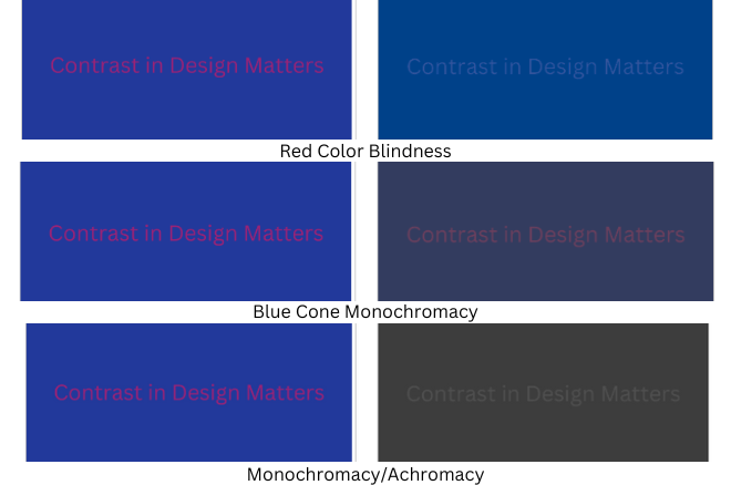
Already the design above isn’t super legible. Mostly because the contrast between the blue background and purple text is too slight. That issue renders the design almost completely unreadable with red color blindness, color blindness for the color blue, and color blindness that means folks only see in shades of grey.
One of the easiest options to check whether your design works regardless of color use, is with an online tool that allows you to simulate different types of color blindness when viewing a design. That way, as shown above, you know whether or not your design employs color theory and accessible design tenants effectively.
Now What?
Phew! That was a lot. If you’ve gotten this far, thanks for sticking with me through a complex topic.
If you’re feeling overwhelmed, don’t worry! That’s why partners like Else Communications exist. To help you with the complex, nit-picky details of building a brand experience for your business or organization.
Not feeling overwhelmed and curious to learn more? Consider looking at a guide to web and digital design and accessibility like this one from Accessibility Works, or this one specifically for graphic design from RGD Ontario.
